Where sensors meet soil
Where sensors
meet soil:
Background
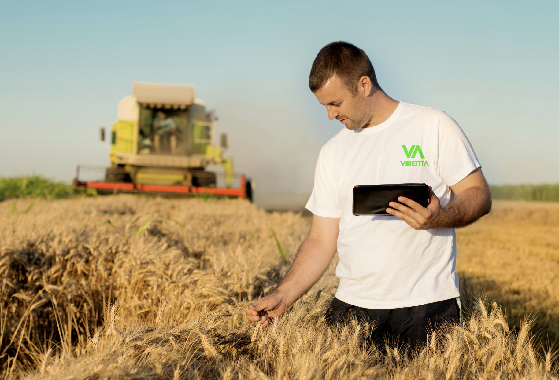
Virenta uses IoT sensors to track soil carbon capture in real time, turning farmland into measurable climate infrastructure. The brand needed to communicate that this is not a vague sustainability story, but a science-led system built on data, measurement, and trust.
Virenta is helping transform farmland from a carbon source into a carbon sink. Using IoT sensors and real-time soil monitoring, the company measures carbon capture at the field level, giving climate action a layer of scientific proof.
The challenge was to create a brand identity that could carry both ecological ambition and technical credibility. Virenta sits at the intersection of regenerative agriculture, carbon science, and digital monitoring, so the identity had to feel rigorous enough for a science-minded audience and clear enough for a broader market.
-
Description text goes here
-
Description text goes here
-
Design
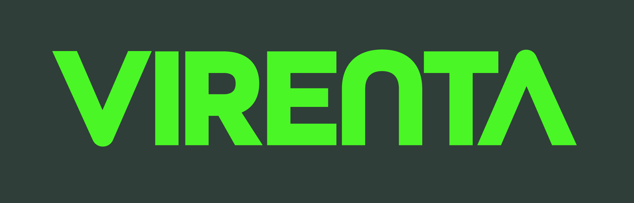
The Visual Language: The brand is anchored by a heavyweight sans-serif typeface called All Gothic Round. This choice communicates stability and "boots-on-the-ground" reliability. It’s a font that looks as good on a digital dashboard as it does embossed on a steel soil sensor.
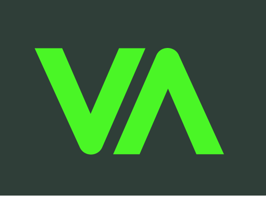
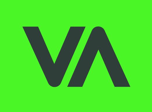
The Signature Mark (The V-A Junction): The core of the visual identity is the custom ligature where the "V"(Vitality/Earth) and the "A" (Advancement/Tech) meet.
The Handshake: By connecting these two letters, we visually represent the "closed-loop" system—reminding the viewer that technology and nature are no longer separate paths. They are one single, strong line.
The Strategic Insight: Most environmental brands use soft, leafy imagery that feels fragile. To win the trust of industrial farmers and global investors, Virenta needed to feel unbreakable. We moved away from "Green Peace" and toward "Green Infrastructure."The V (Vitality) and A (Advancement) meet to form a single, unbreakable point that symbolises a world where we don't just take from the earth, we give back.
THE PERCEPTION GAP
Carbon farming had an image problem. To corporate buyers and regulators, it sounded fringe, too activist, too niche. To environmentalists, any "tech" felt suspicious. Virenta needed to bridge both camps with a single, confident identity.

The challange
Lettermark:
The Virenta lettermark is built around a single idea: carbon in motion. "V"(Vitality/Earth) and the "A" (Advancement/Tech) meet.
By removing the cross bar from the Letter A to create an arrow, and having the V and A the V descends and the A ascends, together they trace the continuous cycle at the heart of what Virenta does: carbon pulled down from the atmosphere, locked into the ground, and the life that rises back up from it.
This custom "V-A" ligature serves as a recurring brand motif—appearing as a framing device in UI/UX elements and as a "stamp of integrity" on carbon-offset certificates.
The Integrity Stamp: A simplified version of the V-A acts as a watermark for "Virenta-Verified" carbon credits.
Field-Ready Assets: From ruggedised sensor casing designs to durable fleet vehicle wraps, the bold sans-serif ensures maximum legibility in the harsh, high-sun environments of industrial farms. The sans serif font fits in the the hi-tech nature of the brand.
Develop a brands identity the reflects the process of the company, while keeping modern, hi-tech nature of the brand without the leafy aesthetics that feel passive and overdone.
Virenta needed to disrupt the space with a visual language that felt industrial, scalable, and urgent. They are not just planting trees; they are re-engineering the global food supply chain from the soil up.
Strategy
GROUNDED BUT FORWARD
The brand had to feel rooted and sold with an appropriate sense of urgency. It needed to signal precision technology without going cold and clinical.
Colours System
Basalt Green #2F3E38 is a deep, muted forest/charcoal green. It reads almost as a dark neutral while still carrying organic warmth. It functions well as a primary background or base tone.
Krypton #4AF626 is an electric, high-saturation lime green. It's the energy of the palette — eye-catching, bold, and unmistakably digital. Used sparingly, it commands attention instantly.
Silicon Silver #D1D5DB is a soft, cool light grey. It provides breathing room and balance, functioning as a body text base, surface colour, or secondary tone against the darker shades.